About
The builder redesign was a large undertaking that involved a large number of developers, designers, product management and input from all departments. The UX team took on the task of talking with customers, developing prototypes, mockups, and solving interaction and process issues across this complex form building platform. I worked on specific elements of the new builder concept as well as lead the UX team of a UX Designer and UX Researcher.
Much of this project was a very collaborative effort. Below are some highlights.
Major platform changes
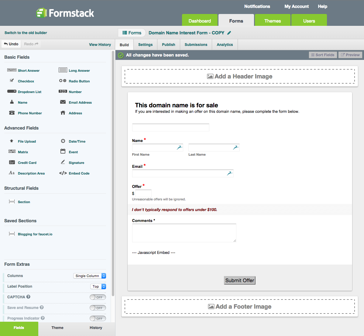
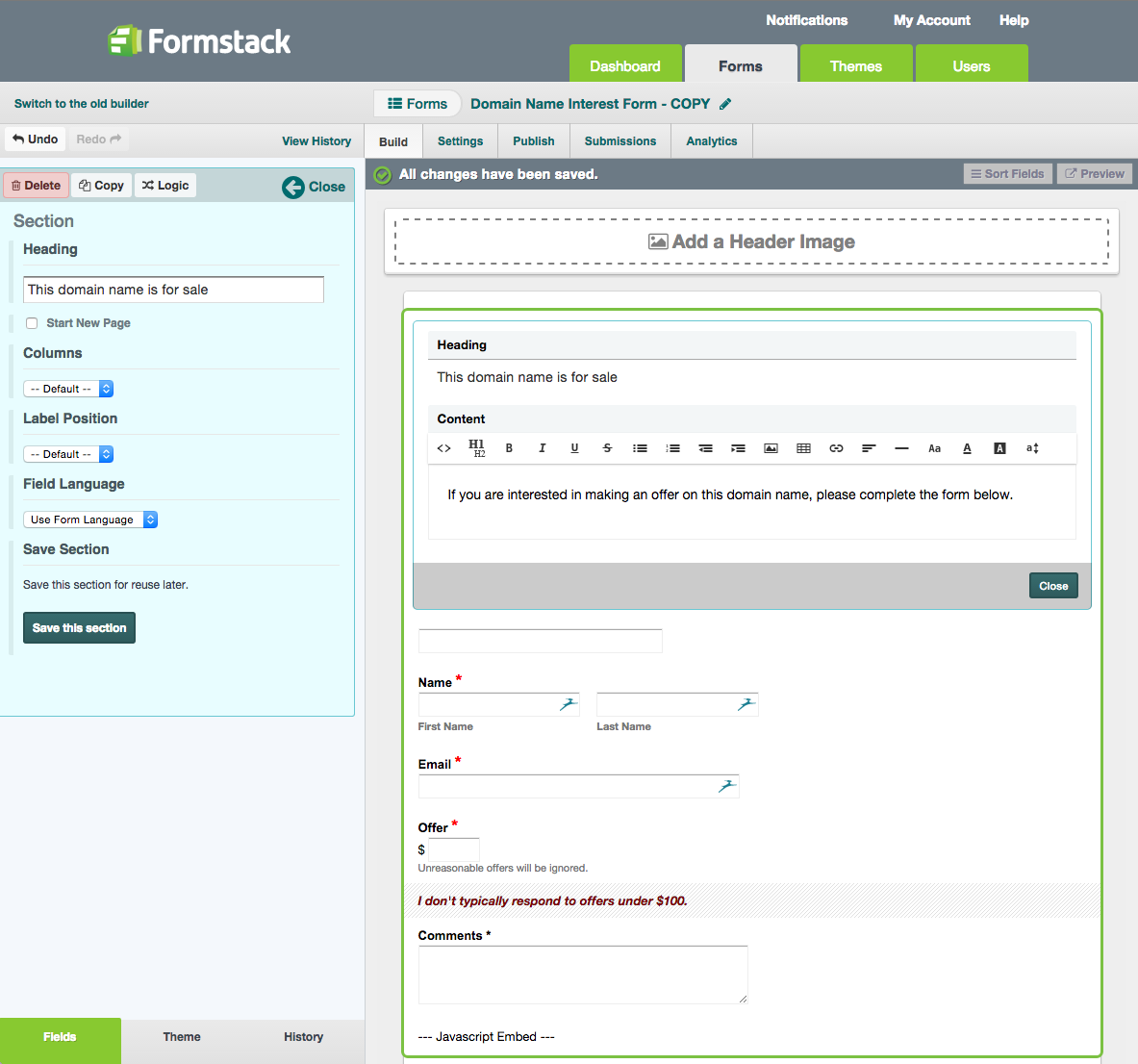
A few of the key driving concepts behind the redesign were to make the form builder experience more inline with what the final product (your published form) looked like. To that end, we also wanted the building experience to feel more natural. In previous iterations of the builder, while making most edits or additions, the form would be obscured by your editing window. This led us to move the majority of editing areas to the sidebar and let changes update the preview area in real time. Much internal testing, tweaking and end-user testing was involved in improving this overall concept.
Conditional Logic
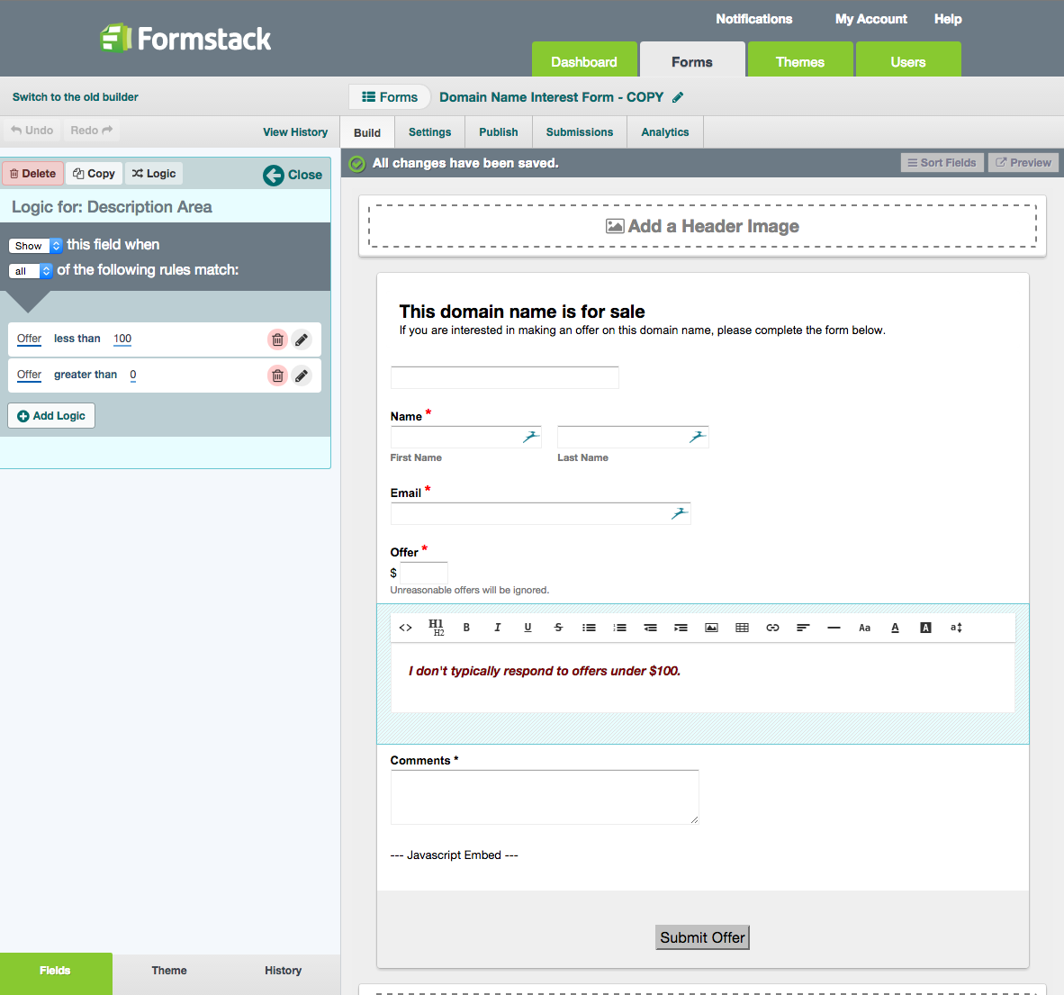
An area of the builder that can be both very powerful and very confusing is conditional logic. It's the ability for areas of a form to be hidden or displayed based on answers given on other fields on the form. I led the redesign of this area of the builder with the goal of simplifying the interface for adding logic and making it easier to quickly understand how logic was applied to any field.
The end result used color, spacing, and basic shapes to help differentiate different areas of the interface. When viewing the logic, form fields would be hidden and the logic would be represented in an easy to understand sentence format. Clicking on a logic item would then enter edit mode and display all the fields the user could make changes to.


